+65 9146 7978

Chimp.
Overview
Problem Statement: Users with vision problems tend to take a few tries to tap on buttons on a mobile app. This is a problem as they might give up using the application and this could lead to a decrease in app usage.
Chimp. is an imaginary mobile application designed to provide Singaporeans with a quick and easy-to-access service platform.
It was created as part of a UI/UX module in Digipen where the goal was to have high-resolution mockups up in 3 weeks.
Chimp. is the latest service platform in Singapore. Launching in 2025, it is a platform that provides customers with an easy and secure shopping experience. Chimp. aspires to provide Singaporeans with an accessible platform with a low price point.
End Product: High-Resolution Mockups, Style Guide, and a Figma Prototype.


Product Vision
The goal of creating the Chimp. mobile application was to take inspiration from designs of existing apps and to improve on them to boost user experience. Such improvements include:
-
Making buttons look and feel easy to select to users
-
Using simplified universal logos that every user will understand
-
Making navigation between screens straightforward and linear
As a starting point, I did some market research on competitors to investigate the current UI/UX trend in the market and take inspiration from particular features that I liked about each app. I then moved on to creating a rough flowchart to visualise how the app will flow from screen to screen and drew low fidelity layout sketches to get a rough idea on how the app will look like.
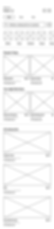
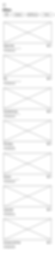
Wireframes
Based on the rough flowchart and sketches, I was able to identify issues like:
-
An overwhelming number of UI elements in a screen
-
Too many screens to get from one service to another
-
Inconsistent button designs
After fixing the issues, I started to create high-fidelity wireframes. During this process, I finalized the proximity between UI elements and where the elements should be placed.


Design Process
Firstly, I had to choose a color scheme for the application, which is yellow and white, since it has to follow the color of the Chimp. Logo. Next, I had to decide on the resolution and chose the iPhone 11 Pro Max since I could refer to my phone, which was 2688 x 1242px. Finally, I got to work and started creating components and their variants. Here were some challenges I faced during this process and how I overcame them:
I used colorful images to represent categories which caused the Home Page to look overwhelming.
Solution: Changing the images to simple universal logos that users will understand.

Before

After
Initial test users had difficulty navigating to previous screens because the Back Buttons were small and thin.
Solution: Adding a border around the arrow made it easier to tap as the button was bigger.

Before

After
Some of the pages looked plain and empty, which did not give a good first impression to users.
Solution: Adding more Chimp. logos and splash page made the pages look more interesting.

Before
After
Most of the people who have seen the app could not see the words on the screens despite it being on the computer. They also could not see some of the white words that were on the yellow background.
Solution: I increased the initial font size and bolded the text.

Before

After
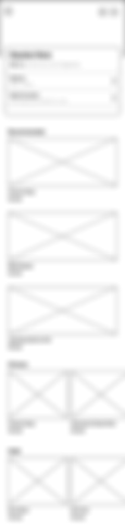
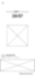
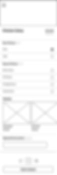
High-Resolution Mockups
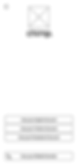
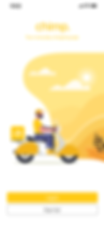
Chimp. Loading Screen
Users are greeted and introduced to Chimp's logo

Chimp. Log In / Sign Up
Users will be prompted to log in or sign up for a new account

Chimp. Account Select
Users can choose to use their social media accounts or their mobile number

Chimp. Enter Mobile Number
Users will be asked to enter their mobile number to receive a confirmation code

Chimp. Enter Code
Users will be asked to enter the code that they have received

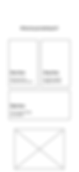
Chimp. Services
Users will be asked to choose the service they wish to use

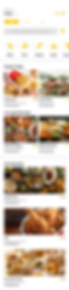
Chimp. Dine Home Page
Users will be able to choose the restaurant they wish to purchase from
Chimp. Food Add-Ons
Users will be asked to choose add-ons to the food that they have selected

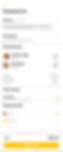
Chimp. Cart
Users will be able to check out the food that they have added to cart
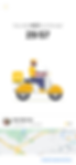
Chimp. Delivery
Users will be sent to the delivery page where they can see when they will receive their delivery
Prototype Process
I used Figma for this project so that I can make changes to the app on the fly. My goal was to create a working prototype. Before that, I had to plan the transition animation between screens and the possible animations of UI Elements.


Along the way, I also faced some challenges while prototyping in Figma. Such challenges include:
The feedback of UI Elements when interacted with was not obvious enough as the initial animations planned were simple color changes or image changing.
Solution: Using the smart animate transition instead of others, I was able to make the animation of UI elements more lively as I was able to do squash and stretch animations and have elements move from one spot to another instead of it fading in and out.
Some users were not able to catch some transition or animations between screens and they felt that the transition was too sudden. Different users had different opinions on whether the animations were too quick or just right.
Solution: I conducted a small user test among a few people who are a part of my target audience and got a majority vote that the animations were indeed a bit too quick to catch and I changed the speed from 100ms to 300ms.

Takeaways
Some key takeaways from this project are that:
-
Always follow the process. Since this was my first official mobile app UI/UX project, I skipped a few steps here and there and when I realize there were mistakes, I had to backtrack to fix them before I could move on, which took quite a bit of time.
-
Keep elements consistent throughout. This is important as all elements should follow the style guide. Thankfully, Figma has a few tools to make this task way easier.
-
First impressions first. Having a good logo/ brand name is important as it determines whether the user will remember and continue to use the application. First impressions are the most memorable for humans and applications too.
