+65 9146 7978
Facebook Gaming Research
Overview
Problem Statement: Users prefer to use other gaming/ streaming platforms over Facebook Gaming as the flow of the application is all over the place and the pages do not look consistent. This resulted in low usage of Facebook Gaming.
Facebook Gaming is an existing application created for gamers by Meta to watch and stream games at their own convenience.
It was research done for a UI/UX module in Digipen where the goal was to research an existing application and make it better.
This was a six-person group project and I was mainly working on the Mockups, Figma Prototype, and the User Flow.
End Product: Research Document, High Fidelity Mockups, and a Figma Prototype.
Members:
Woo Seik Yee
Wang Cheng
Chu Rui Heng
Michael Seah Jin Han
Elcoms Khang Jun De
Liong Yong An Denny


Product Vision
The goal of this research was to identify problems in the existing application that can be improved on while using other applications like Twitch or Youtube as references. Here are some of the improvements we have came up with:
-
Making the style of the application consistent
-
Simplifying the flow
-
Using universal icons for all users to understand
As a starting point, we did an analysis and internal playtesting to identify the problems in the original Facebook Gaming application. We then moved on to identify our target audience and create possible user flows to lay out the possible improvements we can make to the application flow and create a paper prototype with the improvements we have in mind so that we can start on playtesting to see if our ideas were valid.
User Journey
By creating this User Journey, we were able to identify the pain points and the good design choices made in Facebook Gaming.

Paper Prototype
Through Paper Prototyping, we were able to discover flaws in our version of Facebook Gaming like:
-
There were too many different types of buttons on each page
-
Categories in the game tab were rarely used
-
Users were unclear of where the streamer profile was in the live stream tab
Here were the proposed changes for each respective flaw:
-
Removing the buttons that serve little to no functionalities
-
Removing the Category button in the game tab
-
Implement a dropdown to show the live streamer's profile information
_edited.jpg)
Example Flowcharts

Overall UI Flow

Watch Stream Flow

Search UI Flow
High-Resolution Mockups
After several iterations, we moved on to creating the high-resolution mockups of the flows on Figma.

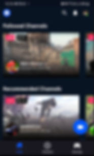

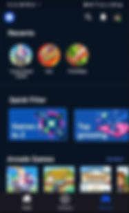
Main Screens
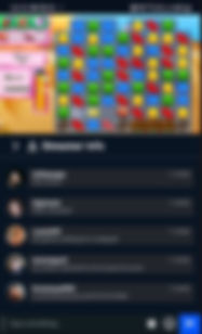
Livestream Screens
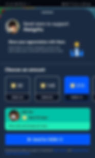
Donation (Send Stars) Screens


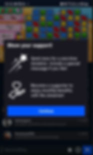
Supporting Creator Screens


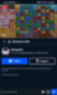
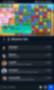
Profile Screens
Prototyping Process
We used Figma for this project so that we can make changes to the app on the fly. Our goal was to create a working interactive prototype.

Along the way, I have learnt valuable lessons to take note of when I participate in a group Figma project in the future. Here are some of them that I would like to share:
-
Always keep the frames well-organized so that other users can find them easily
-
Create components to keep the style and UI elements of the project consistent
-
Keep the components grouped in an isolated area for users to access at all times

Takeaways
Some key takeaways from this project are that:
-
Testing matters. Since we had to work on this project from home, we were only able to do internal testing and with a few other classmates. Thus, we did not gather much feedback and had to iterate the prototype according to how we felt would be best.
-
Keep the project organized. This is important because, in a team project, we have to keep the screens organized so that all members will be able to find the screens easily to make changes,
-
Flow first, visuals second. Having the application look good is important. However, the flow of the application matters more as we would want to give our users a pleasant experience while using the application. Thus, we have to ensure that the app flows well through paper prototyping before we focus on the visuals.
